
This is clearly pointing in the direction of UX challenges around LLM uses. For some tasks the user's critical thinking must be fostered otherwise bad decisions will ensue.


Could XMPP make a come back if the user experience was better?
Looks like we properly live by the "simple by default, powerful when needed" tagline. Now there are also challenges, this article gives a nice balanced view.

Definitely a big announcement for Matrix. Could it be the beginning of going mainstream? I suspect it'll be now or never. I'm slightly concerned about the desktop support being apparently ignored, the UX there is far from great still.

It's better than no feedback. It's a bit lazy and far from perfect though.
Interesting series about the rise of the javascript frontend framework, the bad practices which came with them and the very real impacts on the users. There are indeed better ways.

Interesting discussion about UI density. What are we talking about? Is there value to is? Which aspects of a UI are impacting it? The conclusion makes it all very clear.
Not a reason to make no effort into having as proper error messages as possible. Still there's some truth there that trying to have a really useful error message is a fool's errand.

This is an important request. It has safety implications. It is non-binding request of course, but the insurance companies pay attention to it and so could have an impact.
Or why wording matters... this is clearly a user design fail in this case.
This introduced lack on consistency and predictability in how you can interact with a GUI component is a problem, this will also reduce accessibility. There was value in this "tradition" of the square checkbox vs round radio button.

There was definitely something we lost from the early days of the web. It was not perfect, far from it, but some of that spark is missing.
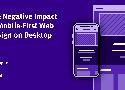
It's nice that we get more content usable on mobiles... but this shouldn't come at the expense of bad usability when on desktops.
Some things we tend to not notice... the scroll bars need a way to be brought back and to be large for better accessibility.
OK, this is a very bleak view... maybe a bit over the top I'm unsure. There seems to be some truth to it though.

Good set of patterns indeed. The article is web oriented but this makes sense in other type of applications as well.
Black has been getting too much of a bad reputation in the last few years. This article makes a good job arguing for a more balanced view.
Interesting idea, personas help with producing features, something is needed to prevent features we don't wante.

Interesting ideas for using large language models. There is a world beyond the chatbot interface and it might bring more value to users and avoid some of the pitfalls of anthropomorphisation.
Probably the best analysis of the new Apple device I've seen so far. Focuses more on the design of the user experience and compares with the strategy behind other similar devices. There are likely a lesson or two to be drawn from it.